During our creative process, we considered ACCESS® Event Solutions’ technologic, consumer experience and logistic aspects, as well as its undeniable growth in the industry as a strong, bold participant. This logo mark contrasts the company’s previous round logo and script letter a, with a bold, squared mark of the same character. As a tribute to the technology boom of the seventies and eighties eras – characterized by basic form, color, and large pixels – the mark is a very simplistic version of the letter. Further, the consumer experience aspect of the company, specifically, is reflected within the negative forms of the character as an exclamation mark.
ACCESS® Event Solutions’ new logotype visually encompasses what the company does, what it stands for, and it also speaks of a strong and confident brand.
A major part of the ACCESS® Event Solutions identification system is the consistent and correct use of the corporate logo. To ensure uniformity, only these versions of the logo are acceptable.



The ACCESS® Event Solutions logo and “A!” mark should always be surrounded by a minimum area of space. A margin of clear space equivalent to 1/3 the height of the “A!” is drawn around the logo to create the invisible boundary of the area of isolation. The mark has a clear space equal to half the width. These areas of separation are a minimum and should be increased wherever possible.
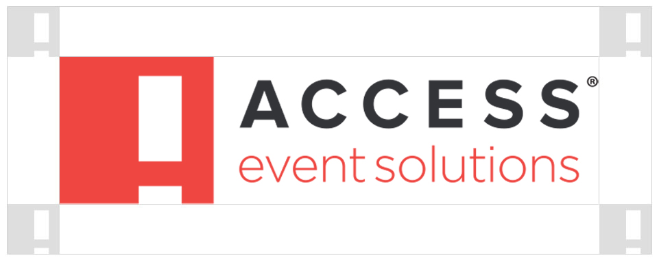
Use of the logo on textured, patterned or elaborate backgrounds is not recommended. In addition, use of logos on photography should also be considered for overall logo readability.
Use of the logo in either white or black is preferred when placing over busy backgrounds or photography. When possible, all logo versions should be used on neutral backgrounds, preferably white, black or grey.

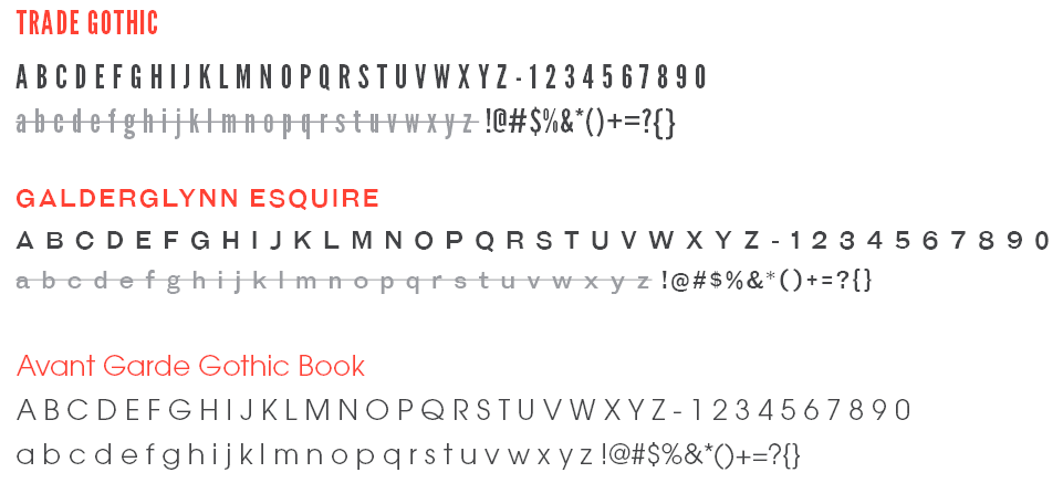
The ACCESS® Event Solutions brand utilizes the font family of League Gothic, Galderglynn Esquire, and Avant Garde Gothic Book for use in corporate branding, marketing and correspondence.
Do not use lowecase of either League Gothic nor Galderglynn Esquire. They do not read well and do not follow the brand’s standards.
The color palette used in the ACCESS®Event Solutions logo consists of the three colors – fuego, dark grey and light grey – with a fourth white variant to use as background.


PRIMARY COLOR
HEX: #EF473A
CMYK: 0/88/78/0
RGB: 239/71/58
PMS: 179
SECONDARY COLOR
HEX: #343639
CMYK: 5/0/0/93
RGB: 52/54/57
PMS: 447
SECONDARY COLOR
HEX: #949A9E
CMYK: 3/0/0/47
RGB: 148/154/158
PMS: Cool Grey 7